Lean Insight
Democratizing Healthcare Intelligence at Enterprise Scale
Designing a zero-trust data operating system that transformed 890K+ raw records into actionable business insights for Saudi Arabia’s largest healthcare conglomerate.
Role
Lead designer
Core Strategy
Enterprise Governance & AI Integration
Timeline
4 Months

The Business Context
The Scale
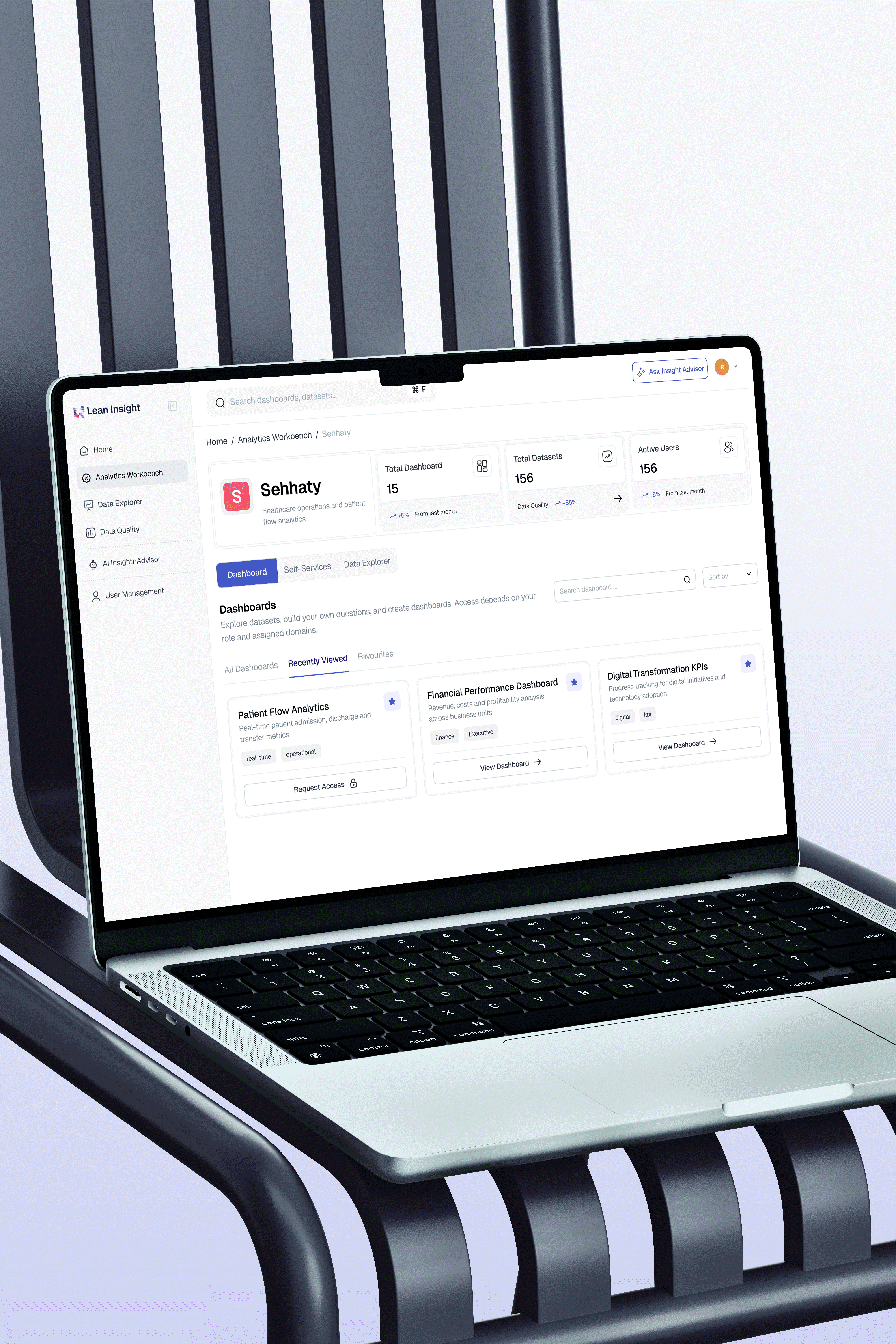
I was tasked with unifying a fragmented data landscape. The organization managed 156 distinct datasets across massive domains like Sehhaty and Roqeem.
The Friction
Executives were drowning in data but starving for insights. The existing workflow required analysts to write complex SQL queries for basic answers, creating a 3 to 5 day lag in decision making.
The Stakeholders
This was not just a user problem. It was an organizational one. I collaborated directly with Data Engineers, Product Managers, and the Legal Compliance Officer to balance usability with strict data sovereignty laws.
The Strategic Conflict
Speed versus Security
My initial audit revealed a critical flaw in the brief. The stakeholders wanted instant access, but unbridled access to 890K records creates a massive liability. Users were already bypassing clumsy security protocols by sharing screenshots via email. This is a phenomenon known as Shadow IT.
If I simply made the data easier to access without rethinking the architecture, I would be scaling a security breach. I had to convince stakeholders that governance was actually a user experience feature, not just a constraint.
Friction vs Adoption
The Decision: We purposely added friction to the export process.
The Rationale: Usually, we design to remove clicks. Here, making data export too easy increased the risk of PII leaks. We accepted a slightly slower export workflow to ensure 100% compliance, prioritizing long-term platform trust over short-term speed.
The Failed Prototype
Why Simplicity Failed the Trust Test
We initially built a conversational AI interface that stripped away all the complexity, giving users a direct answer to their questions. It was clean, minimal, and completely rejected by our power users.
During usability testing, Data Stewards refused to adopt the tool. They asked how they could verify the numbers and refused to bet their quarterly reports on a black box.
This failure taught me that in enterprise UX, transparency outweighs simplicity. We had to pivot from a Black Box model to a Glass Box model where the system logic was exposed to the user.
The Solution Architecture
Reducing Cognitive Load
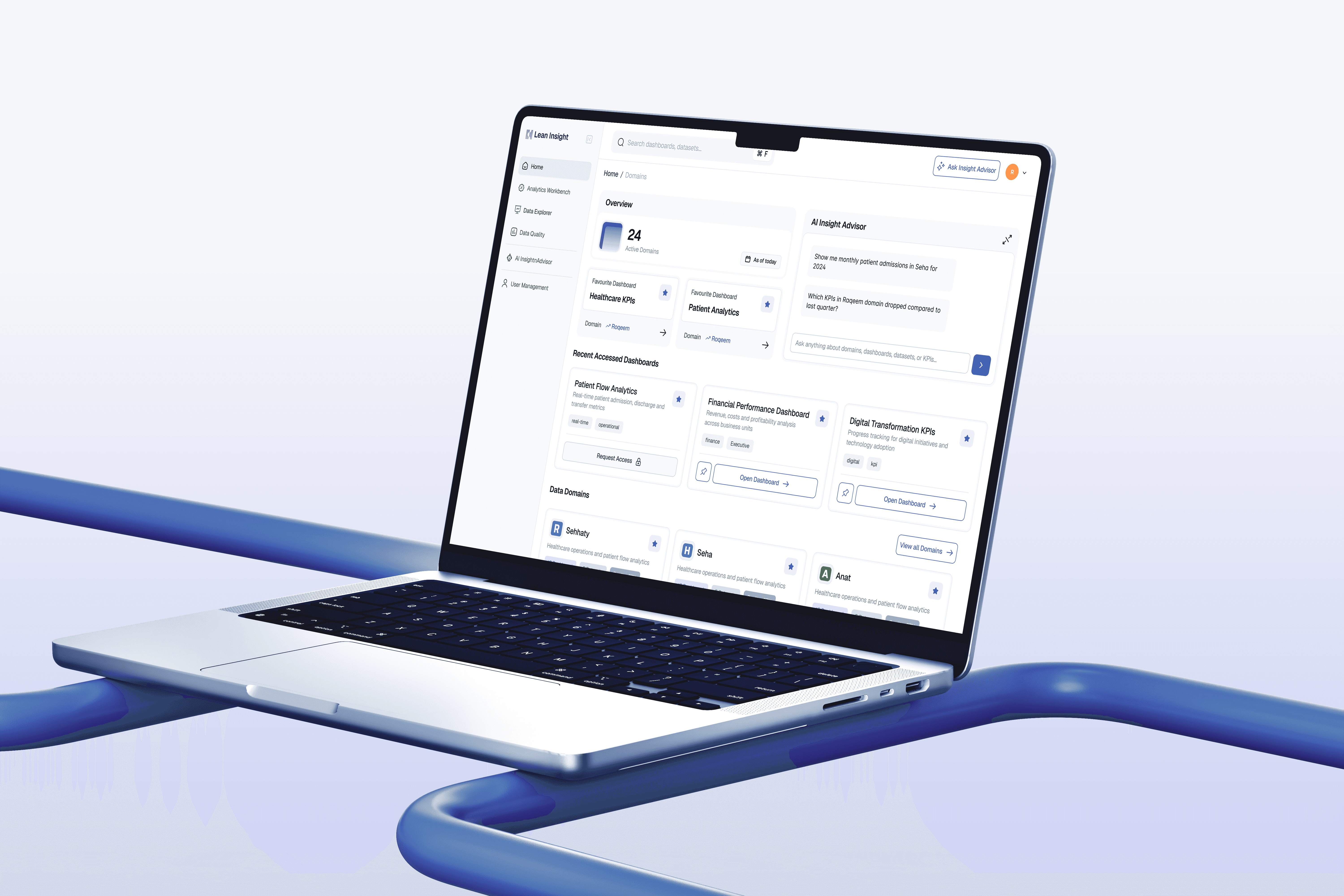
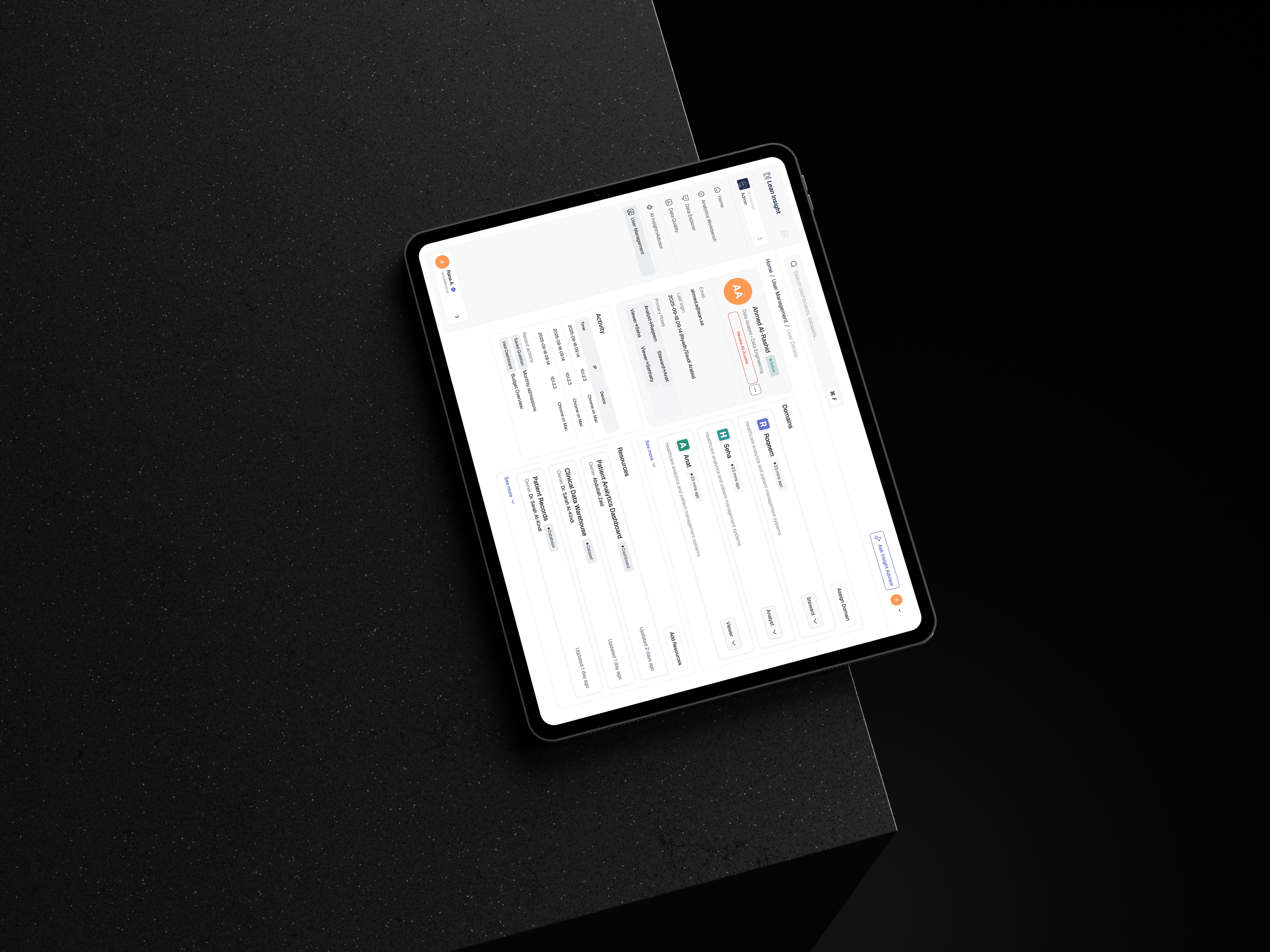
To solve the Black Box problem, I redesigned the Natural Language Interface to include citation layers. Every answer provided by the AI now links directly to the source dataset. This simple UI change bridged the gap between the executive persona who wants speed and the analyst persona who needs verification.
Reducing Cognitive Load
We also tackled system latency. Complex queries take time. Instead of a generic spinner, I designed specific metadata loading states that inform the user exactly which databases are being queried. This manages their expectations and reduces abandonment.

Accuracy vs Latency
The Decision: We chose to display a loading state for 3 to 5 seconds rather than showing a cached (potentially outdated) answer instantly.
The Rationale: In healthcare, data freshness is non-negotiable. We traded immediate gratification for data integrity, using the loading animation to communicate system status and keep the user engaged.
Visualizing Compliance
I worked with the Legal team to map every data field to its sensitivity level. I then translated this spreadsheet into a UI pattern.
In the Schema View, I implemented high-contrast PII (Personally Identifiable Information) tags on critical columns like patient_id. This acts as a cognitive speed bump. It does not stop the user from working, but it visually signals risk before they attempt to export or share data. This effectively digitizes the company compliance handbook.
The Administrative Backbone
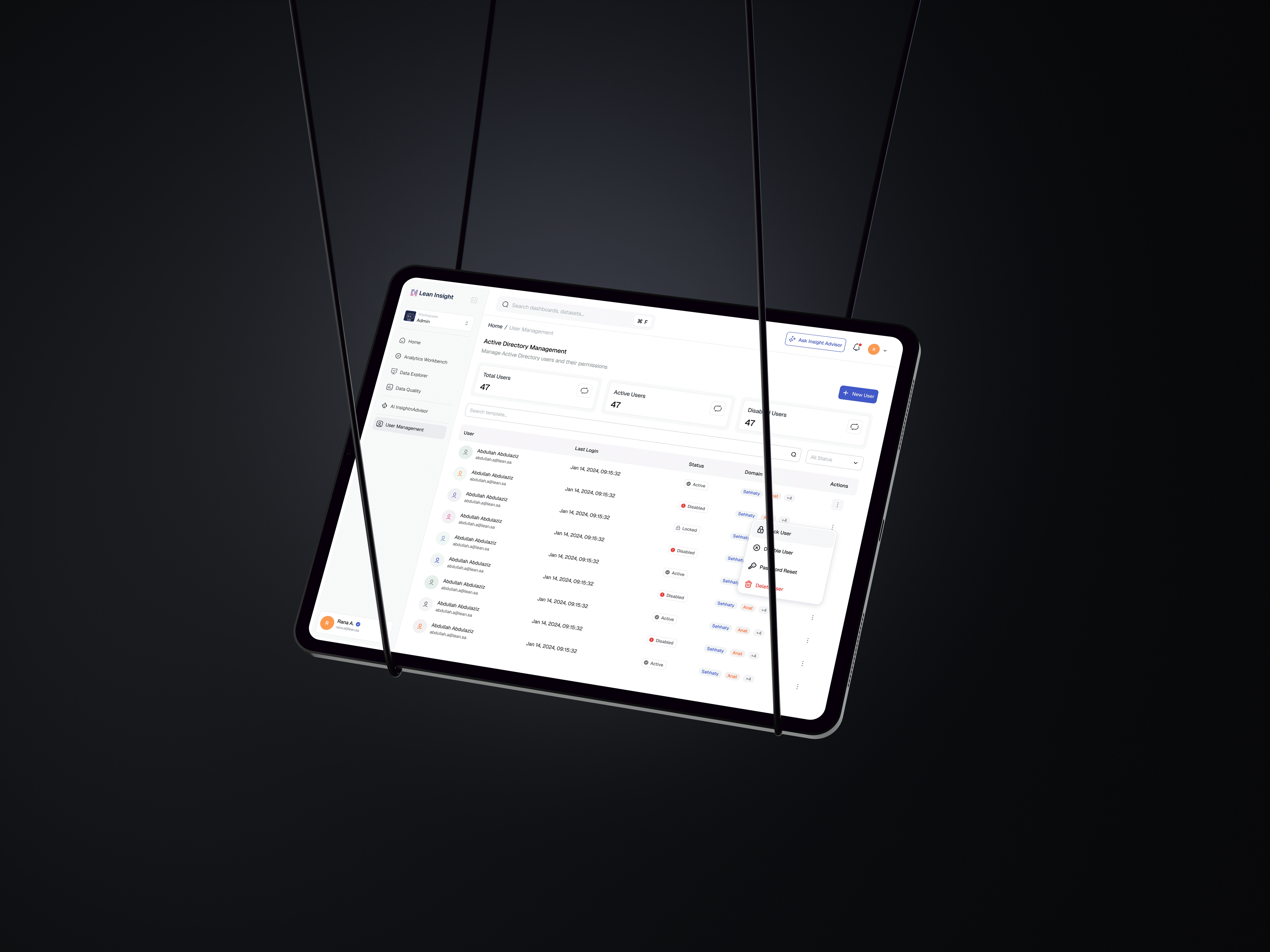
A scalable product needs a scalable defense. I designed the Admin experience to handle the entire user lifecycle. This included Role-Based Access Control (RBAC) and automated audit logging.
The most critical feature was the Kill Switch. This is a specialized UI pattern allowing admins to revoke a user access across all 15 domains instantly. This feature turned a complex IT ticket process into a single interaction, ensuring the organization could contain threats in seconds.
Flexibility vs Control
The Decision: We removed the ability for users to invite external guests directly, restricting it to Admins only.
The Rationale: While this increased the workload for IT Admins slightly, it eliminated the risk of unauthorized external access, which was a primary KPI for the project success.
The Impact & Metrics
Projected Efficiency Gains
By benchmarking the old SQL workflow against the new Natural Language Search, we reduced the interaction cost from 12 clicks to 1. This projects a 40% reduction in Time-to-Insight for standard executive queries.
Audit Readiness
The automated activity logging features have eliminated the need for manual security audits, ensuring 100% compliance with internal governance protocols.
Scalable Architecture
The modular card system I designed for the Domains page successfully handled the growth from our initial 4 pilot domains to over 15 active domains without requiring a navigation redesign
Retrospective
Navigating the Cold Start Problem
Looking back, we optimized heavily for the Happy Path where the dashboard is full of data. Post-launch, I noticed that new users struggled with the Empty State. A blank dashboard can be intimidating. If I were to iterate on this today, I would prioritize an Onboarding Wizard to guide users to their first quick win immediately, rather than relying on them to explore the catalog unaided.
Work that Speaks Louder
Discover a portfolio where creativity meets impact, shaping industries with bold, innovative designs.
