


Ryno - Compliance Infrastructure That Scales Across Borders
How a 3-person compliance team scaled from 3 countries to 12 without hiring
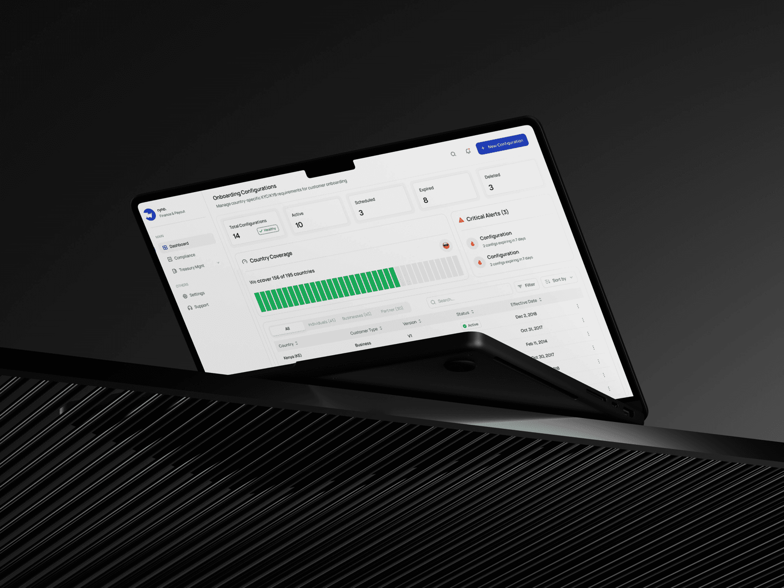
About Project
Problem
Ryno moves crypto payouts across borders for other businesses. Every country their clients pay into has its own KYC rules, its own accepted document types, its own risk thresholds, and regulators everywhere want proof you're actually following those rules, not just claiming to.
When I joined, Ryno was live in 3 markets with a roadmap to hit 12+ within 18 months. They didn't need a dashboard. Dashboards are the easy part. The real problem was structural: document requirements, risk rules, and onboarding steps, all the things that made a market new, were being hand-built each time.
It wasn't one team feeling this pain, it was three, each wanting something different. Compliance needed to move fast without cutting corners. Operations needed to launch countries without waiting on engineering every time. Treasury partners needed visibility into their own numbers without going through an account manager. None of that fit a single generic tool, which is part of why the process had quietly split across a spreadsheet, a Google Doc, and a lot of Slack.
Wallet screening was happening in that shared spreadsheet: check a blockchain explorer, cross-reference some rules in your head, mark it approved. No audit trail, no memory of whether the wallet had been flagged before. It took about 12 minutes per wallet, and the backlog was growing 15% a week.
Country launches weren't much better. Compliance wrote requirements in a Google Doc, an engineer translated that into code, QA caught the gaps, repeat. Three weeks, every time, even when the new country's rules looked a lot like the last one's.
Process
- Shadowed the compliance officer through three live screening sessions: 60% of her time wasn't spent deciding anything, it was spent gathering context across four open tabs, a spreadsheet, a block explorer, a risk tool, and Slack
- She had risk heuristics in her head that were never written down anywhere, like flagging a wallet with zero inflow but real outflow regardless of its official score. The tool wasn't just slow, it wasn't capturing what she actually knew
- Walked through three recent country launches with operations and found the same shape every time: documents, verification method, validity window, risk rules. It just wasn't treated as a repeatable pattern
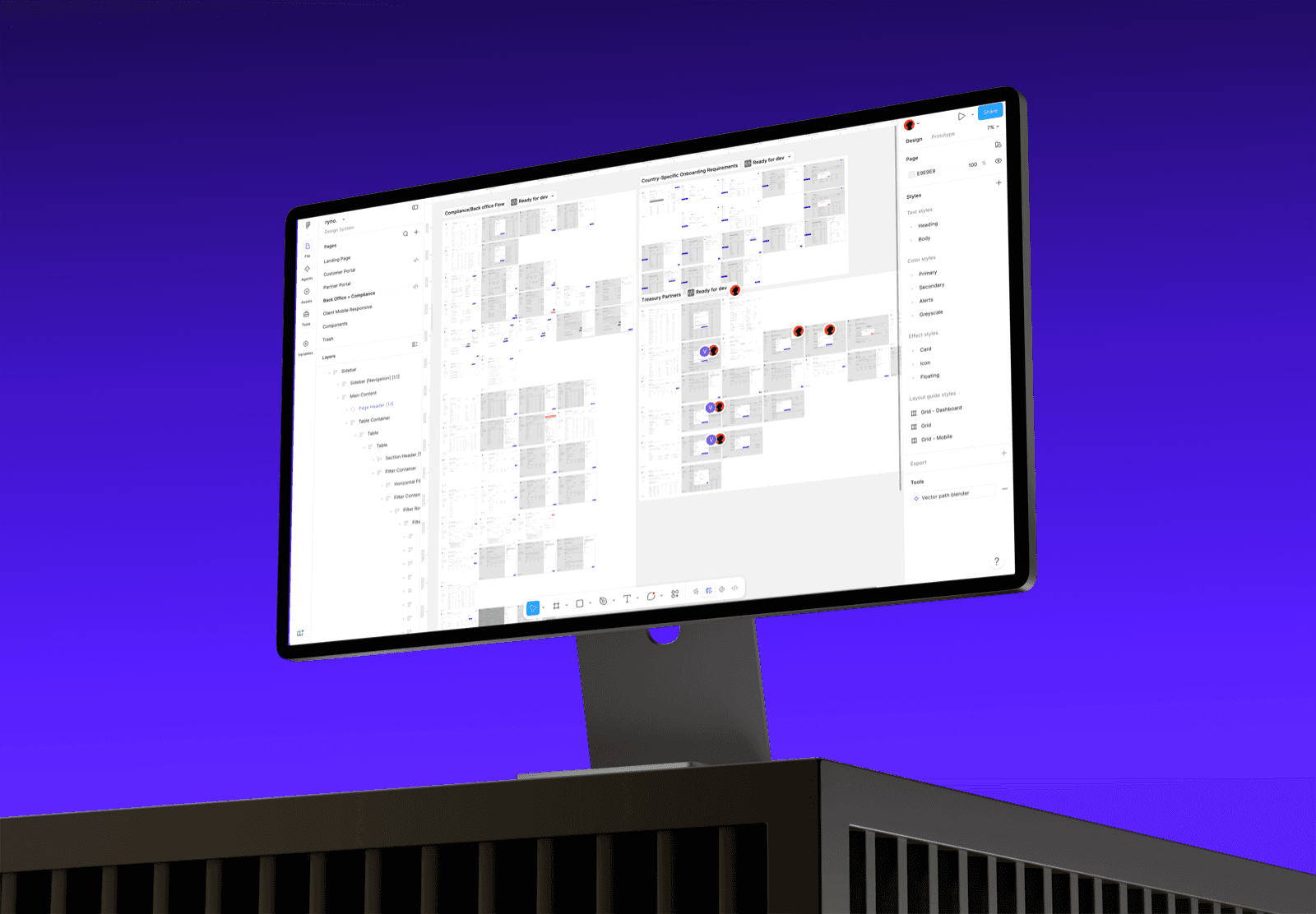
- Looked at how partners were actually using Ryno, through the PM's interview notes, and every request came down to the same thing: let me answer my own question instead of emailing an account manager
Obstacles
The turning point was realizing the compliance team's bottleneck wasn't decision-making capacity. It was context assembly. Once that clicked, getting people faster access to the right information became the real design problem, for all three roles, not just compliance.
My first instinct was one dashboard that surfaced everything: wallet queues, partner stats, onboarding pipelines, all in one place. I sketched it and brought it to the compliance officer, expecting a good reaction.
She shut it down fast and told me plainly it was overwhelming. When she's screening wallets she doesn't care about onboarding. She just wanted focus. That stung a little, but she was right, and it reframed the project for me: in compliance work, cognitive overload doesn't just slow you down, it causes actual errors, and errors here carry regulatory consequences. Focus wasn't a nice to have. It was a safety requirement.
That pushed me toward splitting the product into separate role-based portals instead of patching the dashboard idea: a compliance portal and a treasury partner portal, each built for how that person actually works. Inside the compliance portal, I split further into focused workspaces (wallet screening, document review, country configuration), so nobody screening wallets has to look at an onboarding pipeline they don't care about right now.
The other tension showed up in the country-configuration work. Operations wanted flexibility since every country is a little different, and they didn't want to keep waiting on engineering. But total flexibility, a blank form builder, made it easy to misconfigure a country and miss a required document category, exactly the kind of mistake that gets you in trouble with a regulator. I landed on a structured template instead: the system already knows the categories a country needs (identity docs, address proof, financial docs), and operations just fills in the specifics. Enough structure to prevent mistakes, without losing the flexibility operations actually needed.
Solution
The wallet screening queue
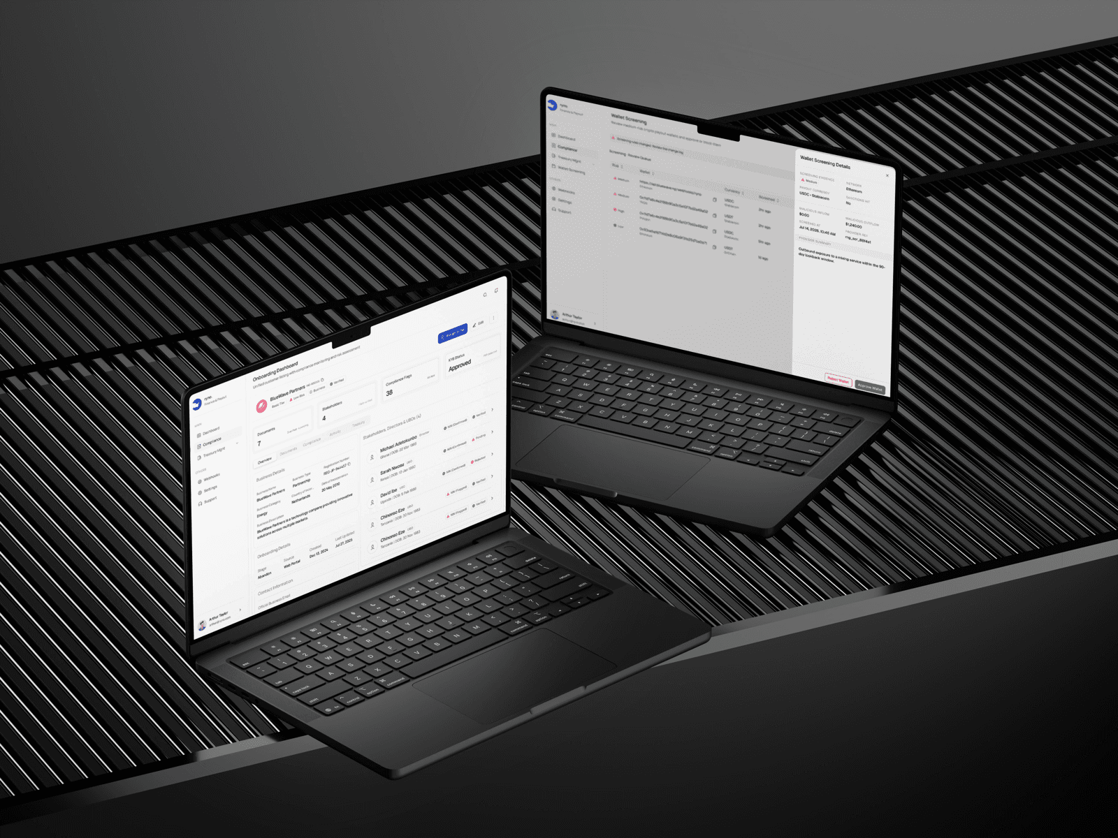
I built the queue around one rule: everything needed to make a decision has to be visible without scrolling or opening another tab. Risk tier comes first because that's how she actually triages, high risk before medium, medium before low, then wallet address, currency and network, and how long it's been waiting.
Clicking into a wallet opens a side panel instead of a new page, on purpose. A full page navigation costs her a few seconds of re-orientation every time, and across a queue of a few hundred wallets that adds up to real minutes. The panel shows the screening evidence, transaction history, and why it was flagged. She approves or rejects from the same panel, and it closes back into her place in the queue.
When the queue is actually empty, the interface doesn't just go blank. It tells her the queue is clear and shows the day's numbers: screened, flagged, total. Small thing, but it gave her a sense of progress and doubled as reporting she didn't have to ask for.
Country-specific onboarding configuration
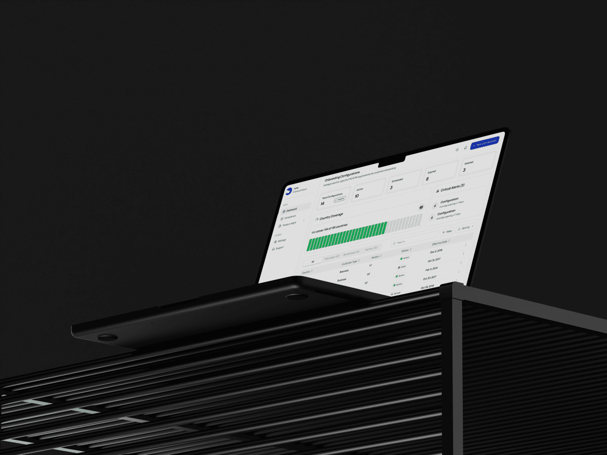
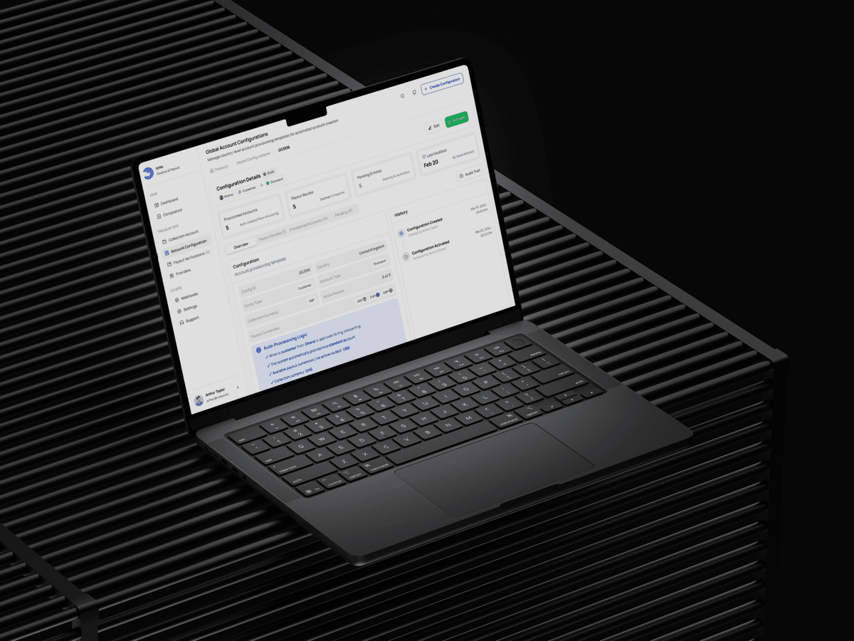
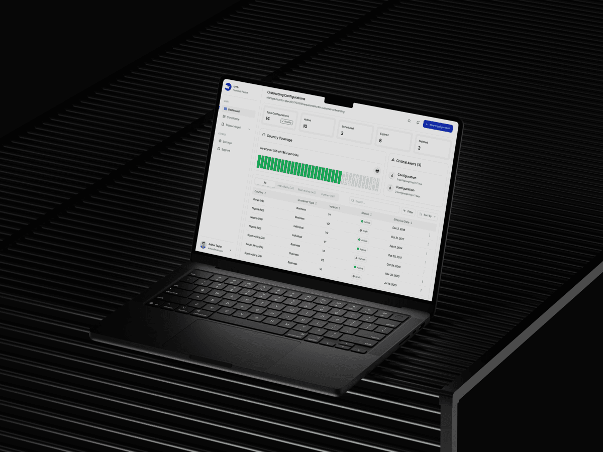
This is the piece that let operations launch new markets without an engineering ticket. Instead of a blank canvas, every country is built from the same structured template: document types, verification method per document, how old a document is allowed to be, which risk tiers trigger extra scrutiny. You can't accidentally skip a required category, because the system already knows the categories.
The view uses progressive disclosure. Country cards up top show how much of a country's config is done versus outstanding, and drilling into one reveals the full structure. Two new markets went live on this system without me or an engineer touching them.
The treasury partner portal
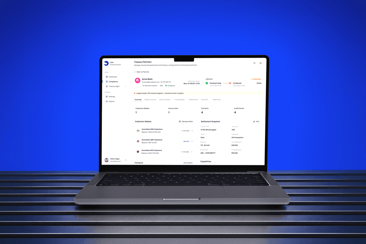
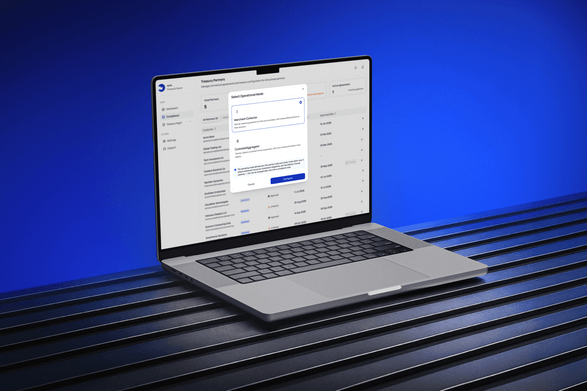
Partners get a scoped view of exactly their own world: their customers, their volumes, their settlement status, mirroring the same information architecture as the compliance side, just walled off entirely to one partner's data. That wall isn't just a permission check, it's architecturally separate, so cross-partner data leakage isn't possible by the way the system is built.
Outcome
Eight weeks after launch, wallet screening decisions dropped from about 12 minutes to about 2.5. The compliance officer told me flatly she doesn't tab-switch anymore. Country configuration went from three weeks with an engineer involved to three or four days without one, and two markets shipped on this system with zero engineering tickets. Partner support tickets dropped 62% in the first month because partners could just look the answer up themselves.
What mattered more to me than the numbers was hearing her say she was making decisions without second-guessing, because for the first time everything she needed was actually on the screen. Ryno is now pitching the partner portal to new treasury partners as a selling point, and the auditable screening workflow became part of their story going into their next funding round.
Close
If I did this again, I'd instrument the old process properly before touching anything. I only have the 12-minutes-a-wallet number because I sat and watched it happen, and stronger before and after numbers would have sharpened my priorities earlier, not just made a better slide later. I'd also go talk to treasury partners myself instead of working from the PM's notes. The portal held up fine, but a direct conversation would probably have caught some of the multi-currency reporting edge cases before they needed a late revision. And I'd run a real accessibility audit on the risk color system earlier. Red, amber, and green with text labels felt sufficient under deadline pressure, but misreading a risk level in a compliance tool has real consequences, and that shouldn't have waited.
The biggest thing I took from this project: constraints are the product. The country-configuration system works because it's constrained, not despite it. A blank canvas would have been easier to build and worse to use. And in a regulated domain, simple is genuinely hard to earn. Every screen here has fewer elements than my first draft of it, and cutting things from a compliance tool is scary, because what if someone needs it. The shadowing sessions convinced me that more information doesn't help anyone make a better decision. The right information does.
More Works
Things You Might Want to Know
[ FREQUENTLY ASKED QUESTIONS ]
For Recruiters & Hiring Managers